Serving Disk Usage Graphs with Bash and PHP
Lately I was asked to develop and integrate a realtime server disk usage graph to the dashboard of our monitoring application (OpenNMS). The bar graph color should also change when disk usage exceeds a defined percentage threshold.
So I came up with some shell and php code that serve well the scope:
Now, let’s go behind the scenes: Since we have a quite mixed environment, I decided to stick to SNMP as mean for getting the data I need to obtain a list of $servername,$disk_usage_percentage (actually, we will need to get disk size and disk used space to calculate the %). A bash shell script (namely “get_usage.sh”) runs at cron every 30 minutes and gets the above info for us, and also takes care of the needed calculation to output the percentage. excerpt from get_usage.sh:
# declaring the server 2D array
declare -A server_id
# declaring SNMP community
rocommunity="YOUR_SNMP_RO_COMMUNITY"

# Example list of monitored servers
# Note that these are 2 dimensional arrays (servername - IP Address)
server_id[server01]=192.168.0.42
server_id[server02]=172.16.0.28
server_id[server03]=10.0.0.3


# function to get disk usage percentage
# hrStorageUsed.1 and hrStorageSize.1 are OID that refers to the first storage disk
# change this parameter to fit your needs
# I ended up with 5 different getUsage_id functions, to cover my storage topology! :)
getUsage_id() {
diskUsage=$(snmpwalk -v 2c -c $rocommunity ${server_id[$HOST]} hrStorageUsed.1 | awk {'print $4'})
diskSize=$(snmpwalk -v 2c -c $rocommunity ${server_id[$HOST]} hrStorageSize.1 | awk {'print $4'})
        ((usage = (diskUsage * 409600) / (diskSize * 4096)))
        return $usage
}

# initialize the output file

> diskUsg.dat

for HOST in "${!server_id[@]}" # enumerates all server hostnames
do
    getUsage_id
    server_id[${HOST}]=${usage} # assign the usage to the servername
    echo "$HOST,${server_id[$HOST]}" >> diskUsg.dat # writing to output file, comma separated
done

exit 0
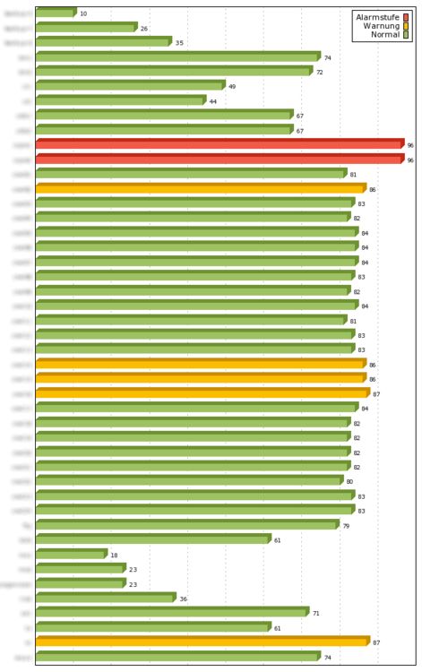
The resulting list will be a file that would look something like:
server01,82
server02,42
server03,98
...
Time for some php! The frame integrated in our dashboard view is a php page that reads the above $server,$disk_usage_percentage list and then uses phplot (http://phplot.sourceforge.net) to draw an horizontal bars graph out of it. excerpt from diskUsage.php:
require_once 'phplot.php'; // get it from http://phplot.sourceforge.net

// We want to autorefresh this page
$page = $_SERVER['PHP_SELF'];
$sec = "840"; // 14 minutes is enough for us (we get new data each 30 minutes)
header("Refresh: $sec; url=$page");

// Define the input "server,disk_usage_percentage" file
$myFile = "diskUsg.dat";

// Here we define the color thresholds:
// 0 (red) for values >= 90%
// 1 (yellow) is for >= 85%
// 2 (green) is for < 85%.
function pickcolor($img, $data_array, $row, $col)
{
  $d = $data_array[$row][$col+1]; // col+1 skips the servername label
  if ($d >= 90) return 0;
  if ($d >= 85) return 1;
  return 2;
}


// Read the data from file and assign to an array
if (file_exists($myFile))
{   $fileContent = file($myFile);
    foreach($fileContent as $line_num => $line) {
     {
       $disk_data = explode(",", $line);
        $data[] = array(trim($disk_data[0]), trim($disk_data[1]));
     }
    }
}

// Here goes the phplot-related stuff

$plot = new PHPlot_truecolor(600, 950);

$plot->SetImageBorderType('plain');
$plot->SetPlotBorderType('full');
$plot->SetDrawPlotAreaBackground(False);
$plot->SetPlotAreaWorld(0);
$plot->SetYTickPos('none');
$plot->SetXTickPos('none');
$plot->SetXTickLabelPos('none'); // No X axis labels. The data values labels are sufficient.
$plot->SetXDataLabelPos('plotin'); // we want to display the disk usage value
$plot->SetDrawXGrid(TRUE);
$plot->SetShading(5);
$plot->SetDataValues($data); // we tell to use $data as actual data
$plot->SetDataType('text-data-yx');
$plot->SetPlotType('bars');

// Remember the pickcolor function?
$red='#F05A46'; // this is 0
$yellow='#FBBD00'; // this is 1
$green='#9EC262'; // and this is 2

// Here we assign the  bar color
$plot->SetCallback('data_color', 'pickcolor', $data);
$plot->SetDataColors(array($red, $yellow, $green));
// We also want to display a legend
$plot->SetLegend(array('Alarmstufe', 'Warnung', 'Normal')); // ja, that's Deutsch! :)

// All set, let's draw the graph
$plot->DrawGraph();
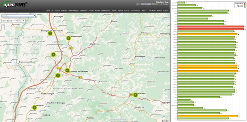
And this is how the whole dashboard will look like, as shown on our Big Monitoring LCD Wall™ :-)